

4.6/5 based on 23,949 reviewers
Increase your influence!
Learn how to apply the 7 Influence principles from Dr. Cialdini via the Cialdini® Institute Practitioner Program.
👉 1500 professionals already learned how to apply the principles of Cialdini. Join them and stand out of the crowd!
👉 Get the official certificate, signed by Dr. Cialdini.
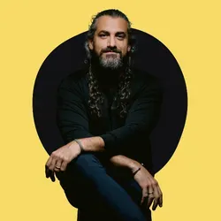
Welcome to the Cialdini Institute. My team and I will be happy to provide you with the soft skills you need to succeed.


Dr. Robert Cialdini
Founder and NY Times Bestselling author of 'Influence' & 'Pre-Suasion'
These companies have boosted their results with our programs


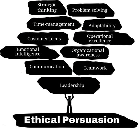
Harness the Power of Ethical Persuasion
You know where you want to go.
But you keep struggling to move others in the right direction.
The big question is:
Do you know enough about the science of how people make decisions and how to ethically persuade them?
That's exactly what you'll learn at the Cialdini Institute.
We teach, train, and coach organizations to ethically apply the science of persuasion to achieve their business goals.
You'll learn the systematic approach of our founder, Dr. Robert Cialdini, which is endorsed by business leaders like Warren Buffett, Guy Kawasaki, and Tobias Lütke, and successfully applied at leading companies worldwide.
It’s ethical, it’s efficient, and it’s highly effective.
With this approach, we can help your organization achieve its business goals too.
Don’t just take our word for it

Warren Buffett
CEO Berkshire Hathaway

“‘Influence’ is one of the best business books of all time.”

Gwyneth Paltrow
Oscar-Winning Actress, CEO goop

“This ‘Influence’ is a classic: it delves into how and why influence works and the specific dynamics at play when leading a company.”

Alex Hormozi
Entrepreneur, investor

“Influence’ is a must-read for entrepreneurship, sales, and marketing.”

Tobias Lutke
Founder Shopify

“‘Influence’ is a book that made me a billionaire.”

Guy Kawasaki
Silicon Valley
Venture Capitalist

“Cialdini is the ‘Godfather of Influence.’ His book is the guiding light for how I conduct business – and in many ways how I live my life.”

Russel Brunson
Bestselling Author & Founder of ClickFunnels

"I've been a fan of Dr. Cialdini for 2 decades! His work has had an insane impact on my business and life - thank you!"

Richard Thaler
Professor of Behavioral Science & Economics Nobel Prize Winner

“If the President had to have one advisor with him at all times, my nomination would be Bob Cialdini, the world’s most practical social psychologist, and the master of ‘Influence’.”

Rory Sutherland
Vice Chairman Ogilvy & Mather

“His work in codifying human behavior, has been priceless.”
Meet Dr. Robert Cialdini
Dr. Cialdini spent his entire career conducting scientific research on what leads people to say YES to requests.
A small selection of his accomplishments:
His seven Principles of Persuasion have become a cornerstone for any organization serious about effectively increasing their influence.
His books, including ‘Influence’ and ‘Pre-Suasion,’ have sold more than 10 million copies in 48 languages.
He is known globally as the foundational expert in the science of persuasion and how to ethically apply it in business.
The best sales tip I ever got was encouragement to read INFLUENCE by Dr. Robert Cialdini. It was so profound and insightful, I read it three times in a row.

Greg Renker
President, Guthy-Renker
ROI, That’s Why
Mastering persuasion empowers you to drive success across all business areas.
Leadership
Skillfully guiding your teams and driving results
Sales
Closing more deals with science-based, ethical strategies
Marketing
Delivering compelling messages that captivate and convert
Communication
Cultivating strong relationships and collaboration
Procurement
Negotiating smarter, securing better deals for all
HR
Fostering a persuasive culture and winning the war on talent acquisition
Dr. Cialdini was the top speaker we’ve ever had… in or out of the organization. They loved him.

Jennifer L. Botelho
KPMG

How We Get You There
Engaging keynotes
On-demand e-learning
Application workshops
In-depth teaching and coaching sessions
Internal trainer certification programs
I must admit, I was skeptical at first, but I really began to understand how to use the principles on Day 2. After the session using the principles on our own influence situation, I was a believer and an influencer.

Greg Eichhorn
Associate Vice President, Quinnipiac University
So, what’s your next step?
Do you stick with the old ways? Or do you go for the breakthrough that delivers a higher return on investment? It’s entirely up to you, of course. But, if this is the moment, it's time to seize it.
Meet your trainers
They will guide you too a good understanding of all the 7 principles of Dr. Cialdini.


Copyright 2025 - Cialdini Institute LLC